Detonate Brewery
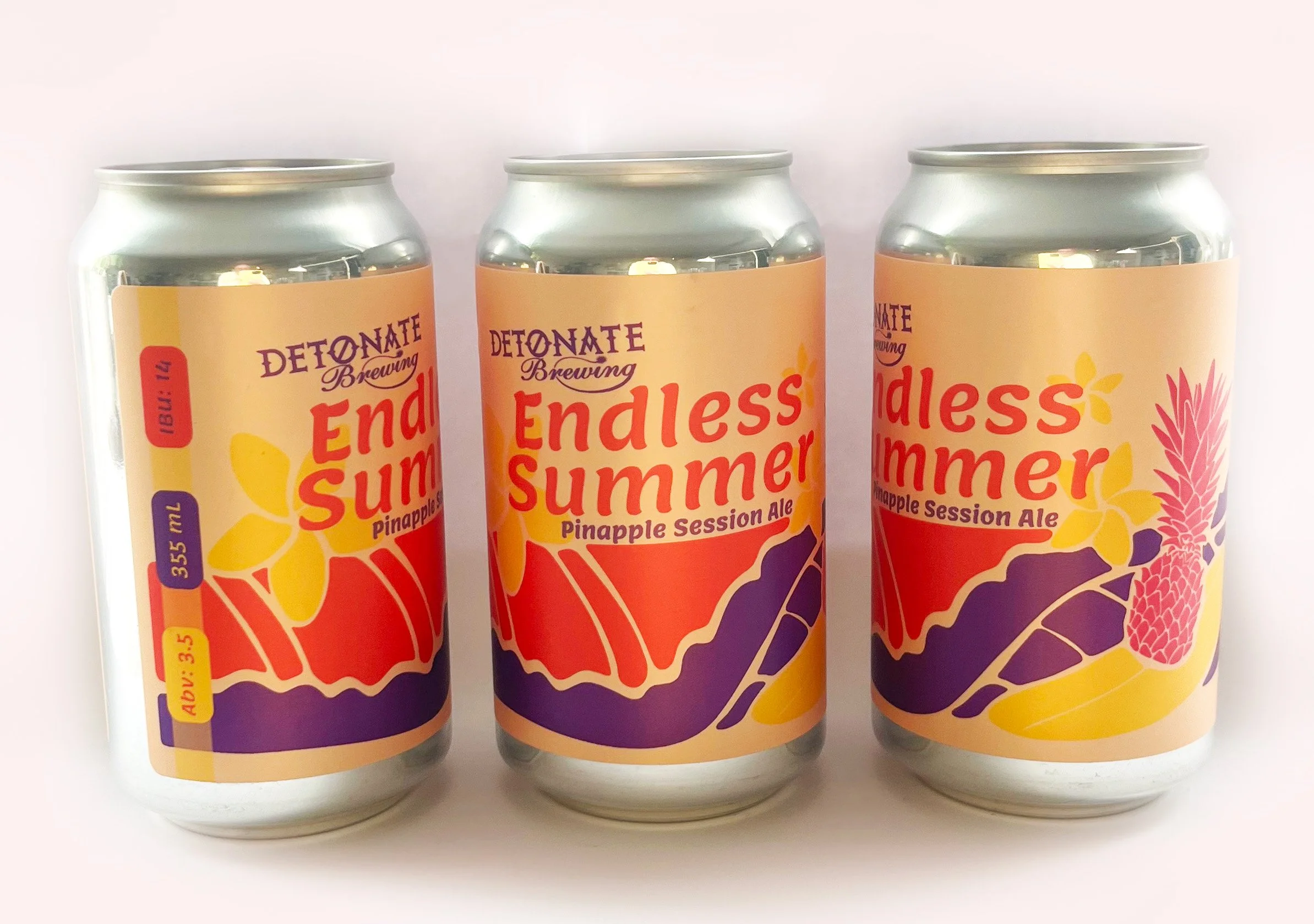
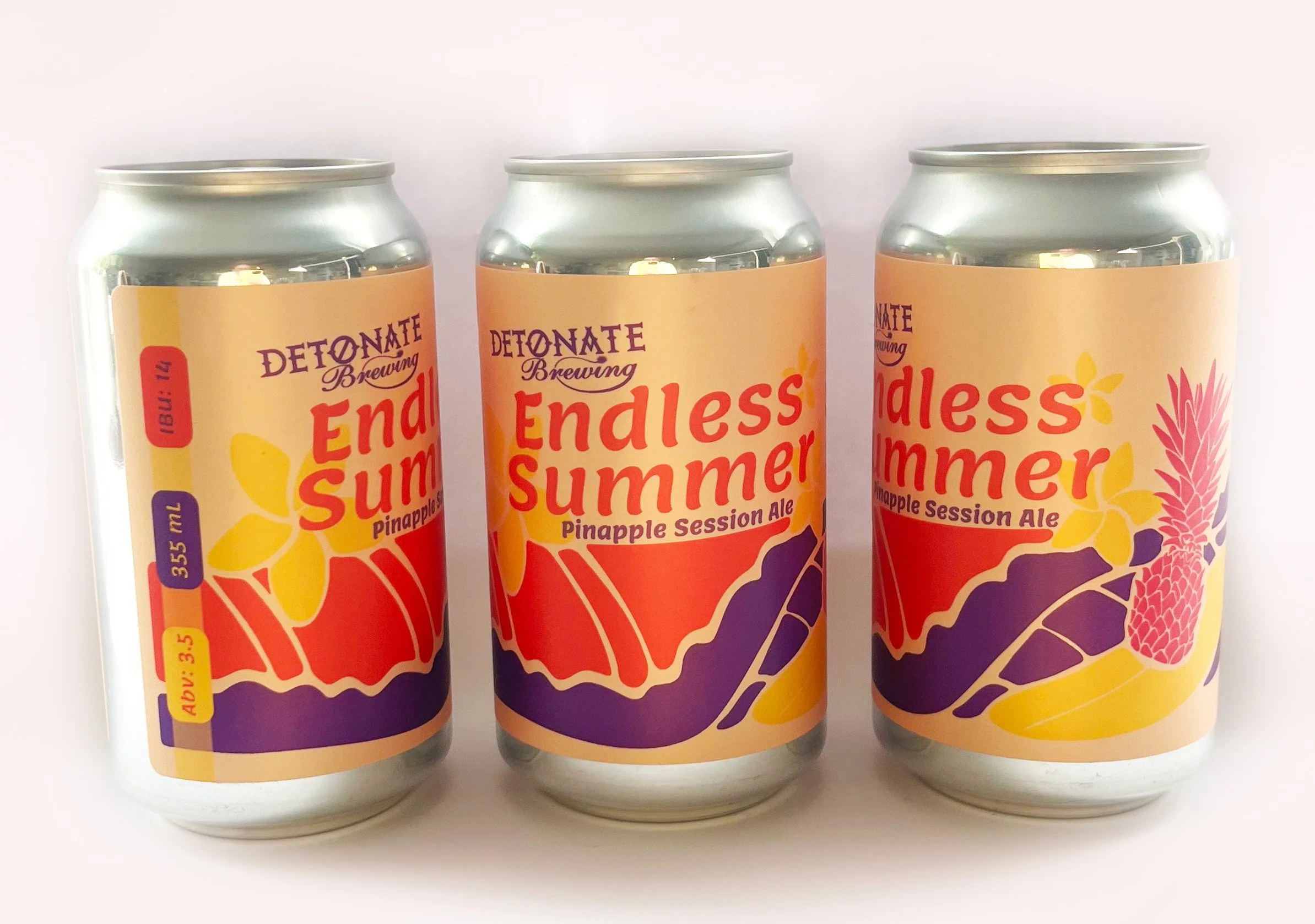
This label design takes inspiration from the distinctive look and feel of risograph printing, using a limited four-colour palette to create a much richer visual experience.
By layering transparent colours, adjusting opacity, and allowing hues to overlap, the design creates the illusion of additional colours while maintaining a deliberately restricted palette. This approach adds depth, texture, and a sense of movement to the artwork, while nodding to the charming imperfections and tactile quality associated with traditional Riso printing.
The result is a bold, playful summer label that feels energetic and contemporary, while using a thoughtful and economical approach to colour.