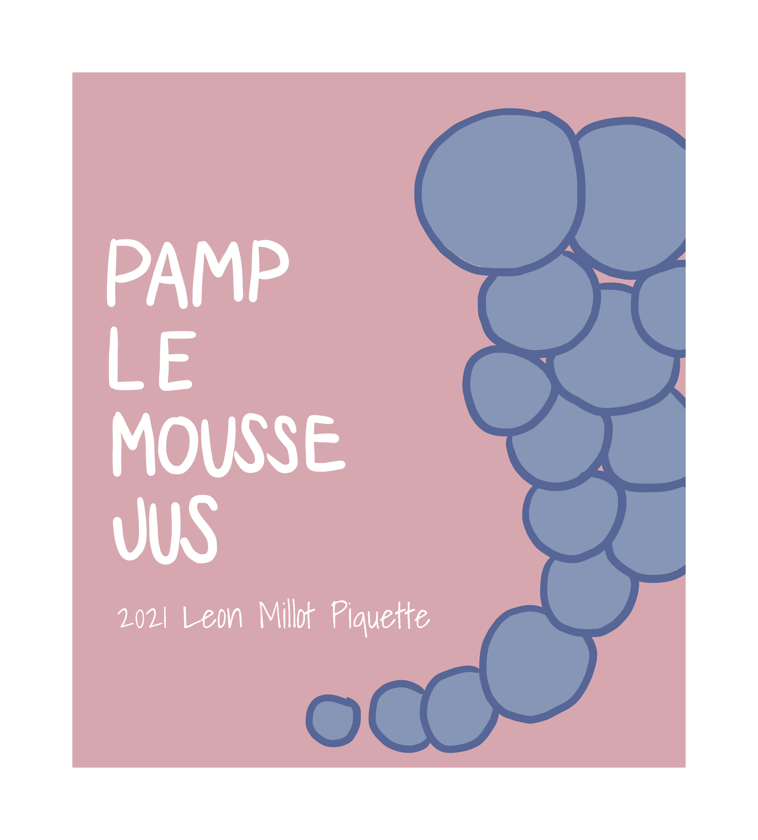
Pamplemousse Jus Wine Label
Pamplemousse Jus is an amazing company I have had the privilege designing for over the past 4 years.
Below is a collection of that work over the years.
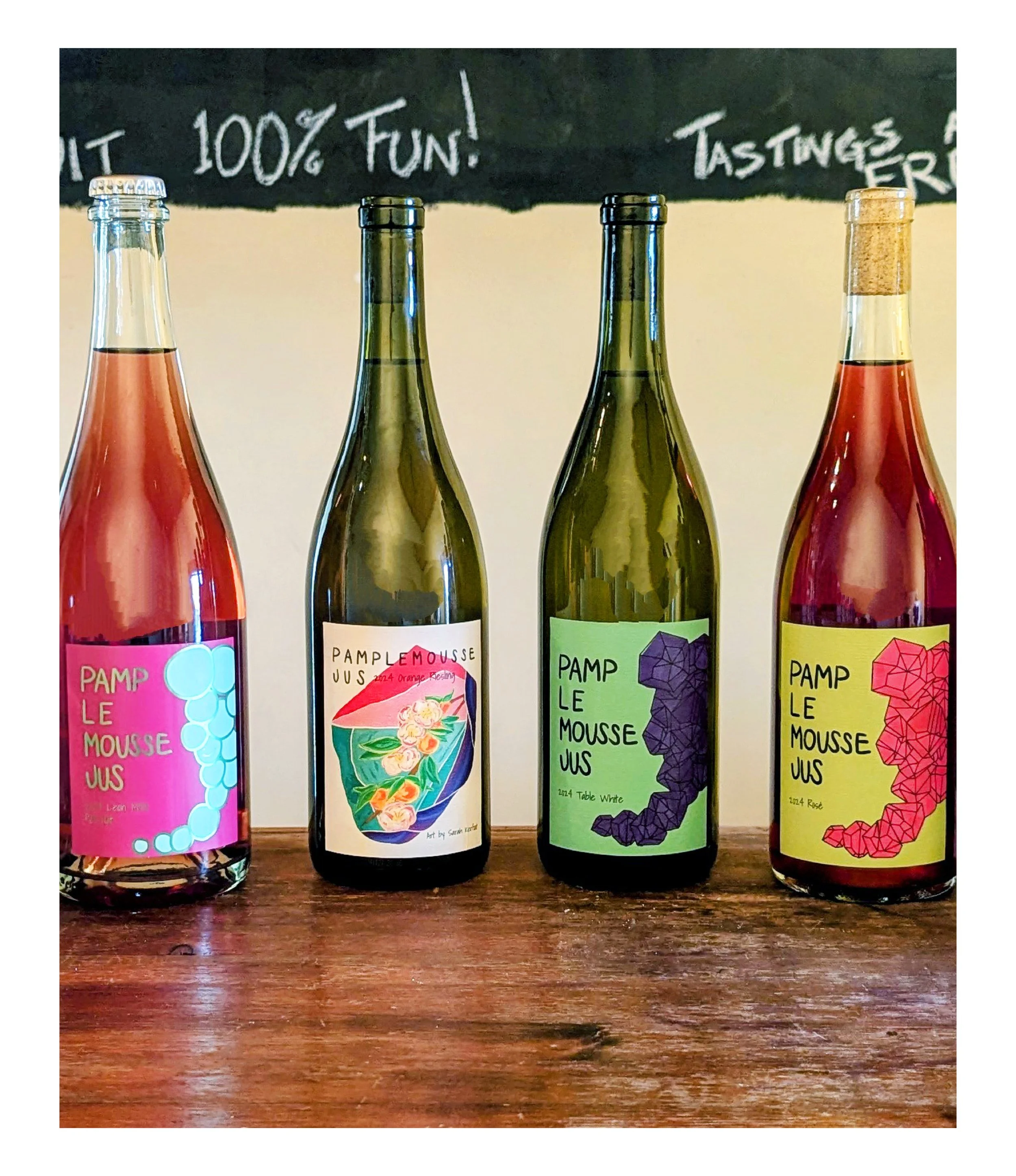
2024 Wine Label Collection for Pamplemousse Jus
The 2024 collection for Pamplemousse Jus has been the most exciting and dynamic yet. This year’s designs feature a fresh burst of fun, vibrant colors, reflecting the energy and creativity that defines the brand. In this collection, we introduced new designs inspired by grapes sourced from newly partnered vineyards, giving the wines a distinct, refreshed character.
A standout feature of the 2024 labels is the revival of the classic hand-squeezing grapes illustration, which adds a nostalgic yet timeless element to the designs. To complement this, I incorporated a range of artistic techniques, from hand-drawn illustrations and gouache paintings to marker sketches, watercolor accents, and digital illustrations. The combination of traditional and digital media not only celebrates the artistry behind winemaking but also highlights the richness and diversity of the wine itself.
The 2024 collection has been a true highlight of my design journey with Pamplemousse Jus, blending innovative styles with a deep connection to the brand's heritage.
2023 Wine Label Collection for Pamplemousse Jus
The 2023 collection was all about vibrant colors and a perfect balance of fun and class. These designs brought a lively energy to the brand while maintaining an elegant, refined feel. The combination of bold hues and sophisticated details made this collection a standout, reflecting the playful yet polished identity of Pamplemousse Jus.
2022 Wine Label Collection for Pamplemousse Jus
The 2022 collection embraced fun, bold colors and explored a variety of artistic mediums, including watercolor and hand illustrations. The designs had a playful yet artistic vibe, blending traditional craftsmanship with a modern edge. This collection stood out for its creative experimentation, where each label felt uniquely personal and full of life, perfectly capturing the spirit of the wines.Fun colours mixed with different medians including watercolour and hand illustration.
Sumac Piquette
For the Sumac Piquette label, I was inspired by the vibrant, striking beauty of the sumac plant. I began by hand-drawing the illustration, capturing the intricate details of the plant’s bold, red hues and unique shape. After the initial sketch, I converted the artwork into a vector format for precision and scalability. The final touches were added in Photoshop, where I refined the colors to ensure the design captured the full vibrancy and character of the sumac, making it a perfect fit for the wine’s lively and refreshing nature.
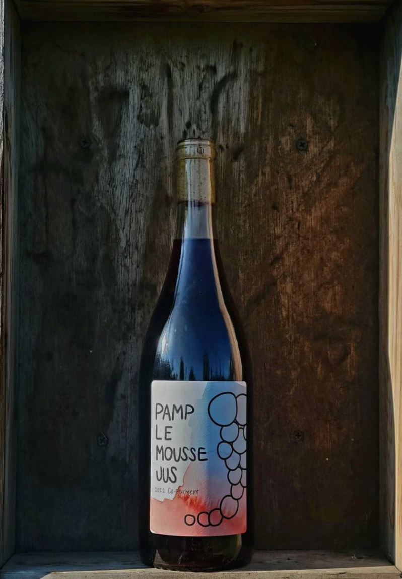
Co-forment
For the Co-Forment label, I hand-illustrated the watercolor design to capture a sense of natural fluidity and texture. After the watercolor was completed, I transformed it into digital art, bringing it to life with vibrant details and adjustments to enhance its depth and richness. The transition from traditional to digital techniques allowed me to maintain the organic feel of the watercolor while adding modern, crisp elements to the final design, creating a harmonious balance that represents the wine’s character.
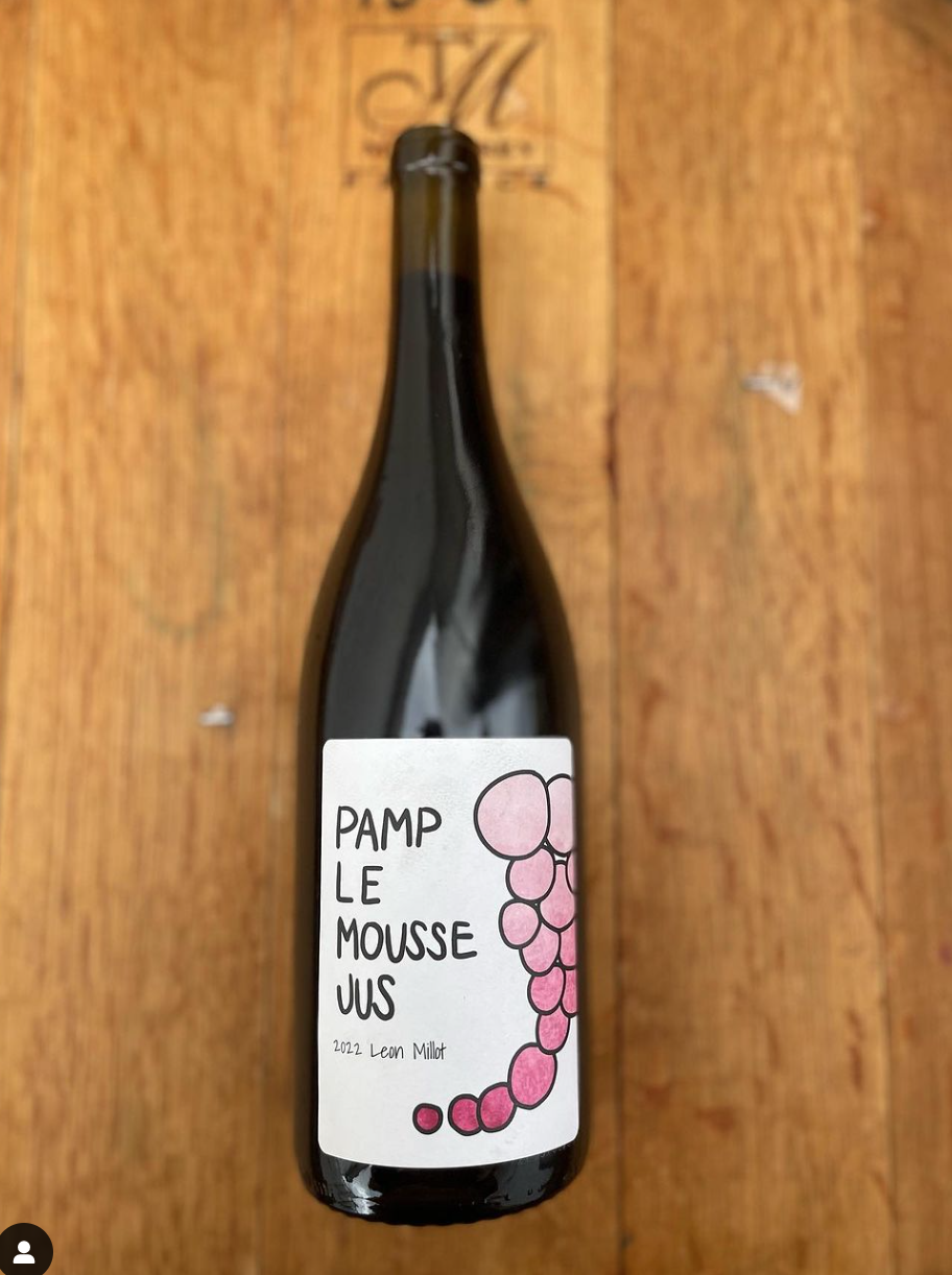
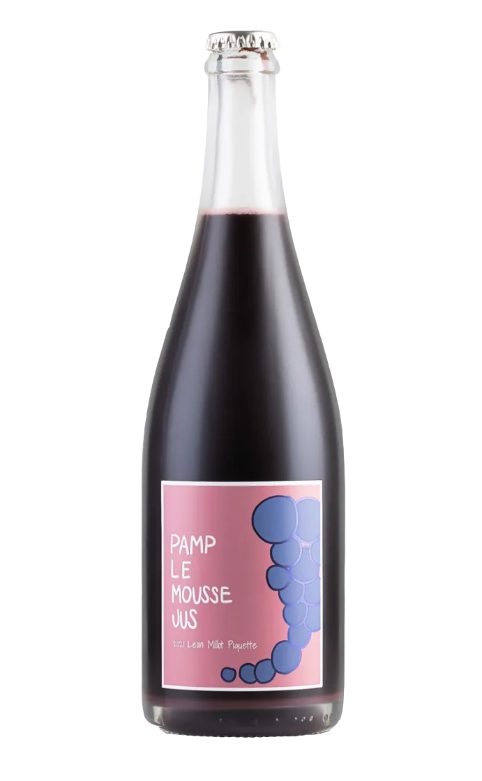
Leon Millot
For the Leon Millot label, I created a hand-done watercolor illustration to capture the natural, fluid essence of the wine. There are three different versions of this label, each with slight color adjustments made in Photoshop to ensure the hues perfectly matched the unique characteristics of the wine. Once the colors were fine-tuned, I brought the designs into Illustrator, where I created a clipping mask to refine the layout and finished the label with crisp, professional precision. This process allowed me to preserve the hand-crafted, artistic touch while ensuring the design was polished and cohesive for production.
Leon Millot Pet-Nat
As one of Pamplemousse Jus’ most popular wines, the Leon Millot Pet-Nat label needed to reflect its fun, lively nature. The goal was to keep the design playful, so I carefully selected colors that enhanced this vibrant, energetic feel. The final label balances a sense of excitement with a polished aesthetic, making it a perfect match for the wine’s personality and popularity.
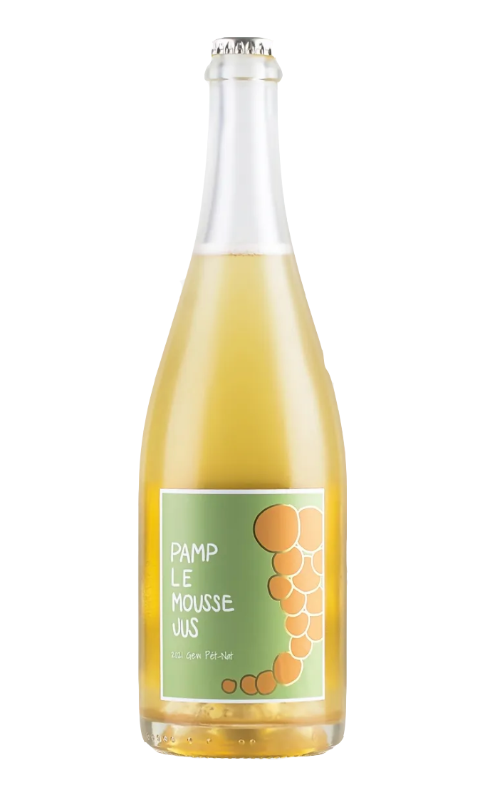
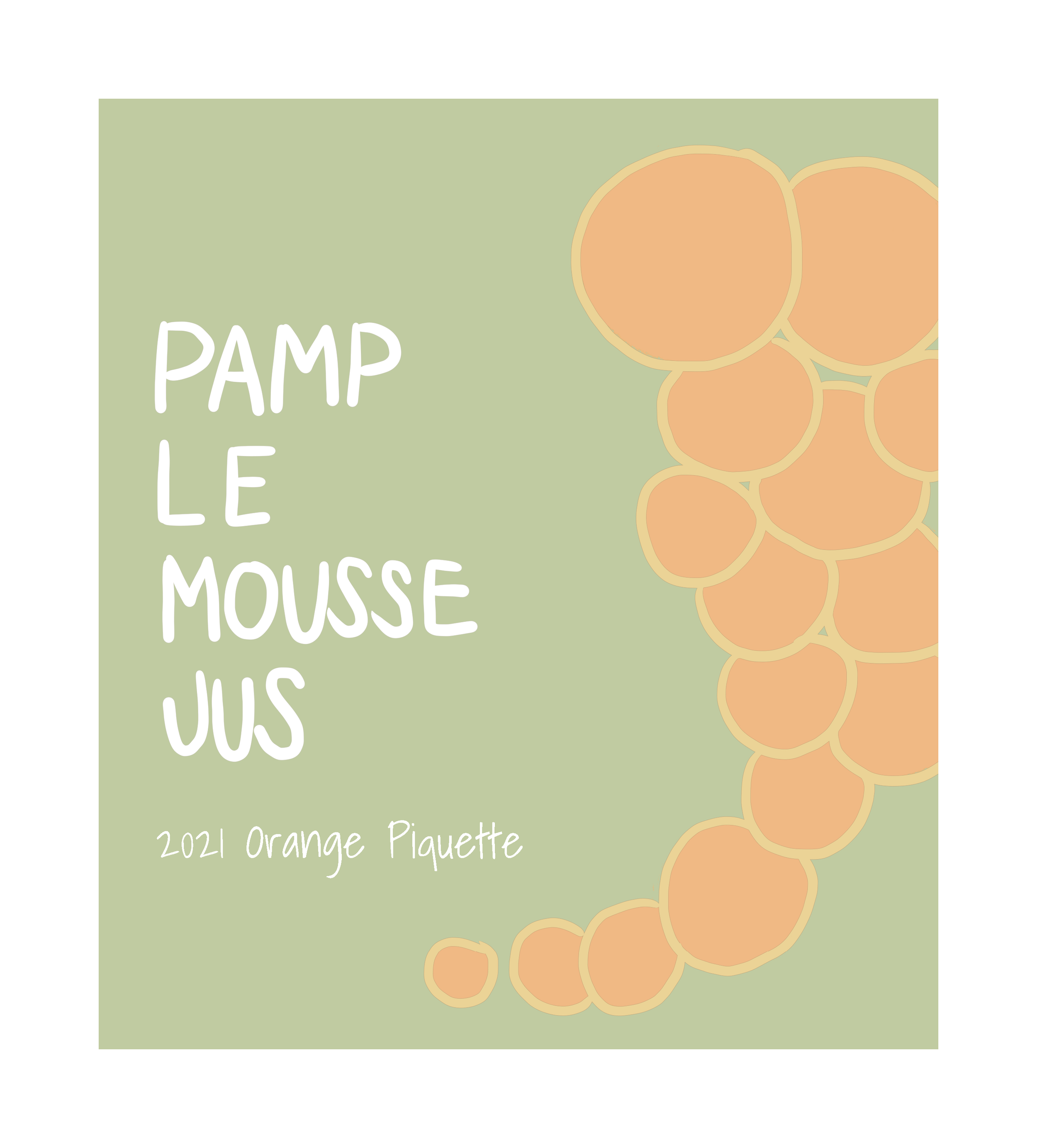
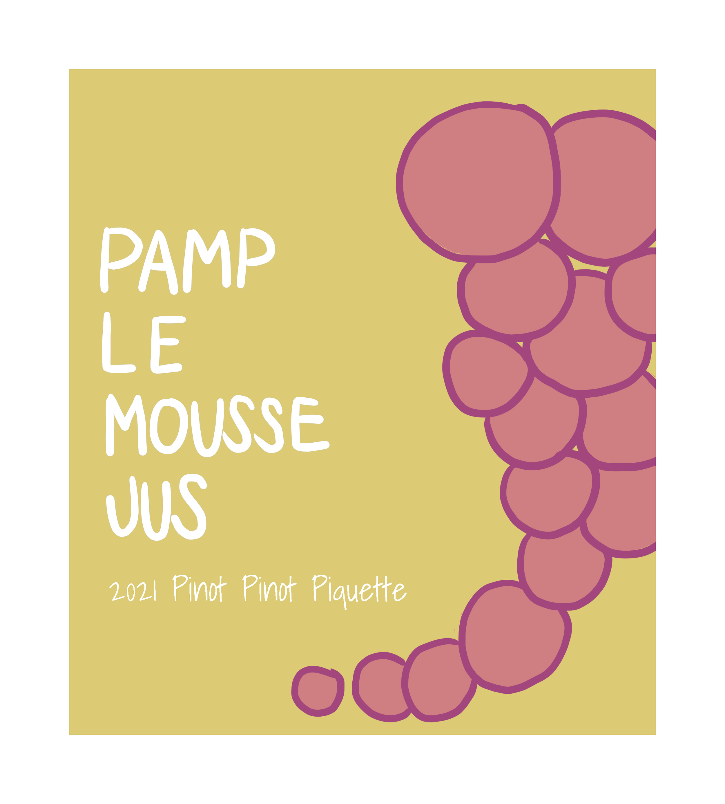
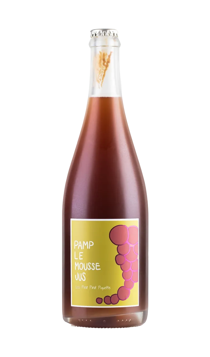
2021 Wine Label Collection for Pamplemousse Jus
The 2021 collection blended soft pastels with rich, trendy colors, creating a refined yet contemporary aesthetic. The use of pastel tones added a gentle, sophisticated touch, while the deeper, more vibrant colors brought a sense of boldness and modernity. This balance of softness and intensity reflected the versatility and character of the wines, making the labels both eye-catching and elegant. Soft pastels mixed with rich trendy colours.

